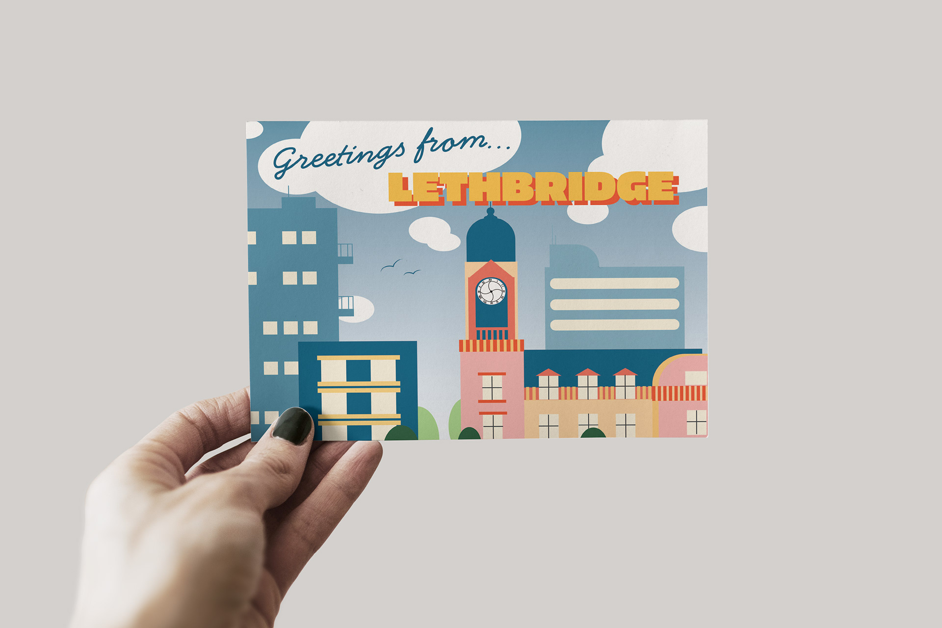
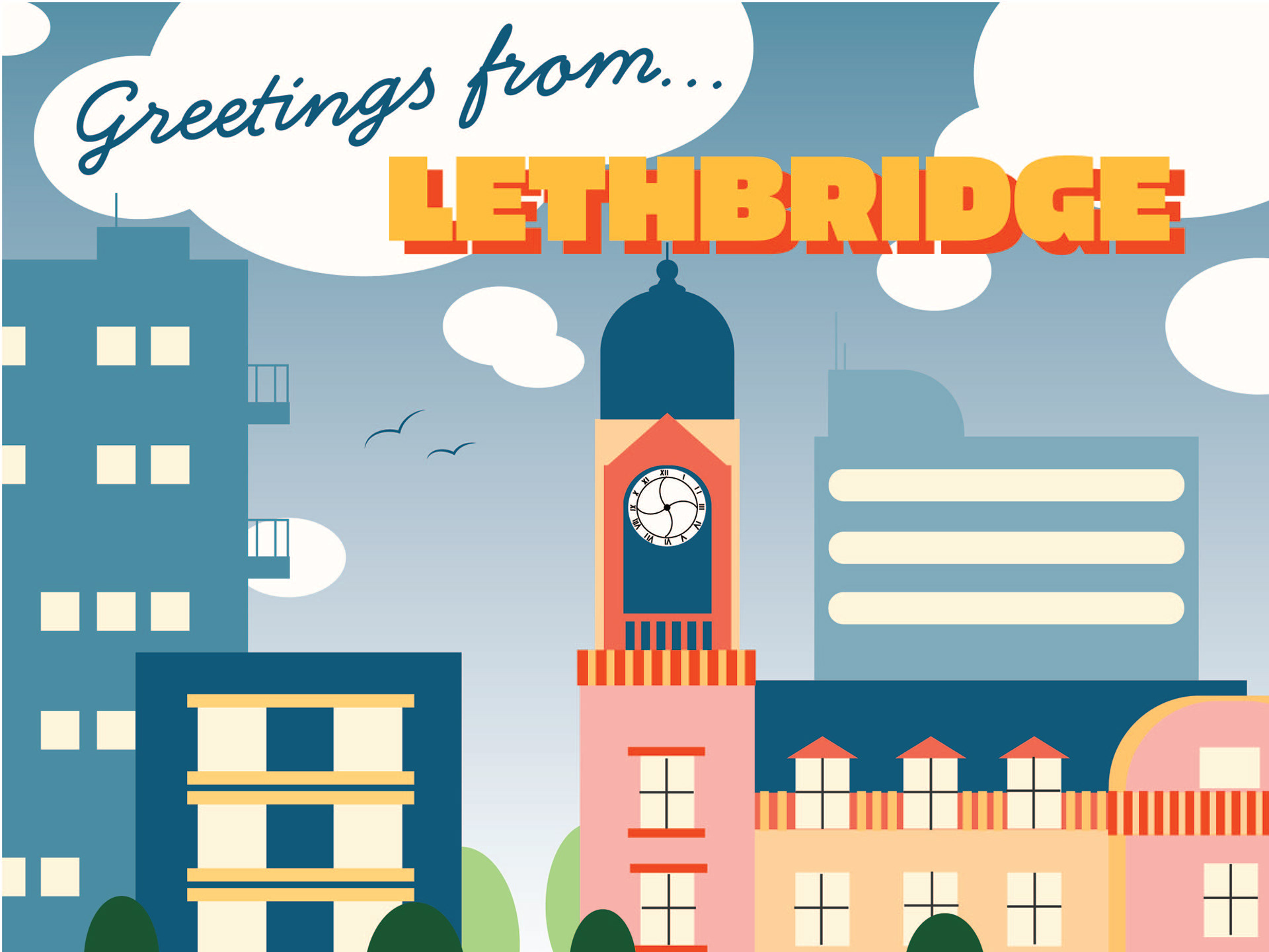
Greetings from...
For this project, I created a postcard showcasing a beloved historical landmark from my hometown—the clock tower that has been repurposed as a bank. Using Illustrator, I designed the postcard to reflect the town's character by employing its official color palette from the branding guide. This design choice ensured that the postcard was visually aligned with the town’s identity. The illustration of the clock tower highlights its architectural beauty and historical significance, offering a nostalgic glimpse into the town’s heritage. The project aimed to capture both the charm of the building and the essence of the community it represents.
-
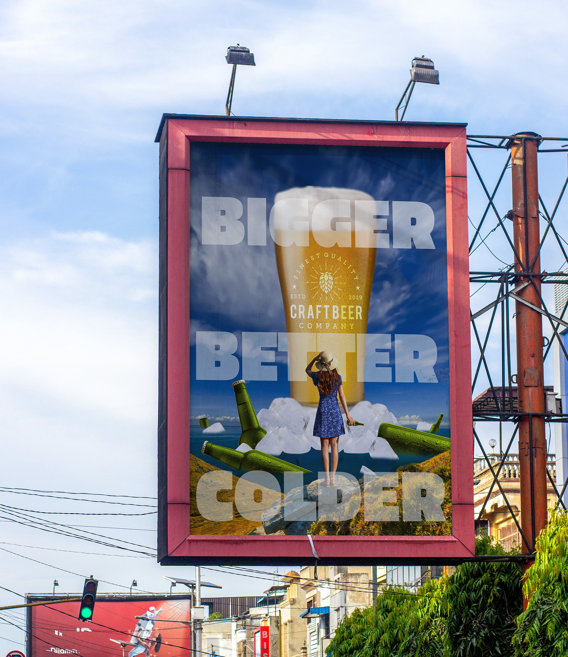
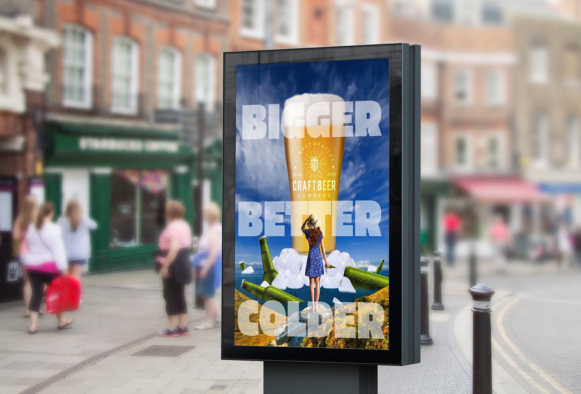
Bigger, Better, Colder
In this project, I created a captivating beer advertisement poster using Photoshop. The design features a visually striking scene with giant ice cubes and a beer floating serenely in the ocean, while a woman looks out from the shore. The aim was to convey a refreshing and relaxing atmosphere that highlights the beer’s appeal. By using bold imagery and vibrant colors, I sought to draw viewers in and evoke a sense of enjoyment and escape. The combination of the floating beer and the dramatic ice cubes creates a dynamic and memorable visual, reinforcing the brand’s message of refreshment and leisure.

-
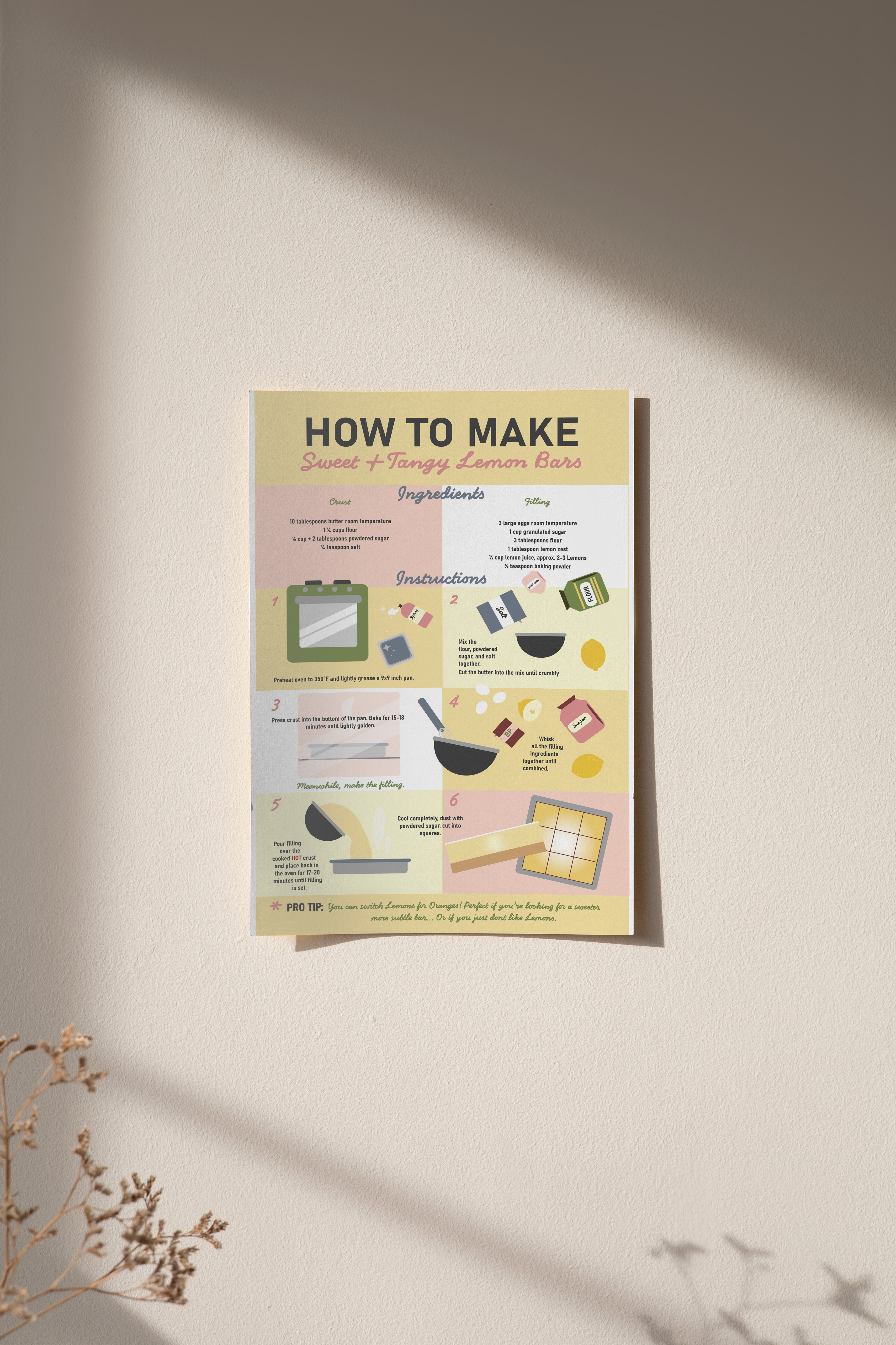
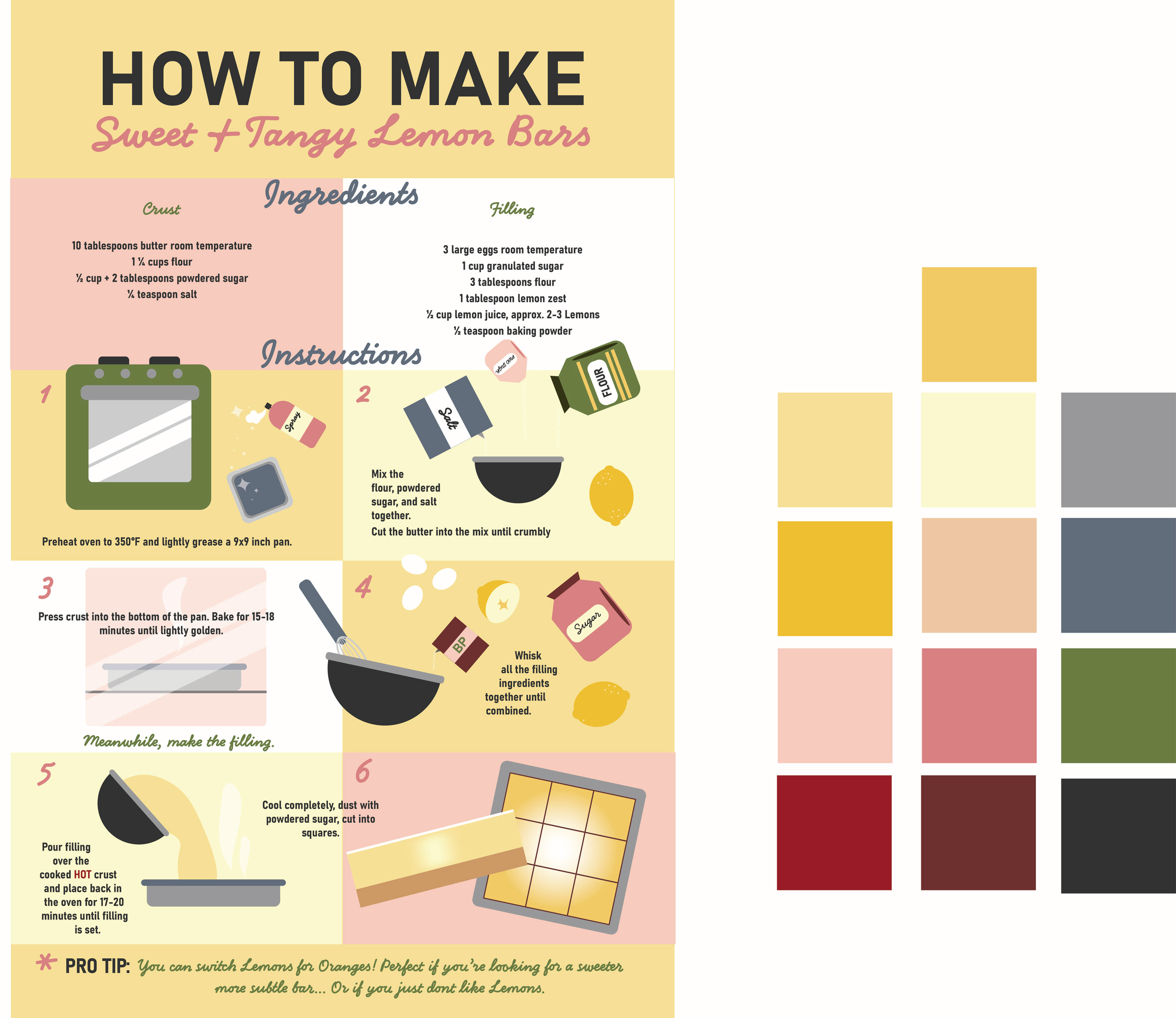
How to make...
This poster simplifies the process of making tangy lemon bars with an easy-to-follow 6-step guide. The design features a soft pastel and bold deep color palette mash up and simple graphics to clearly illustrate each stage of the recipe. This approach ensures that the instructions are easy to understand while maintaining a visually pleasing and approachable look, making it simple for anyone to create this delightful sour and sweet dessert.