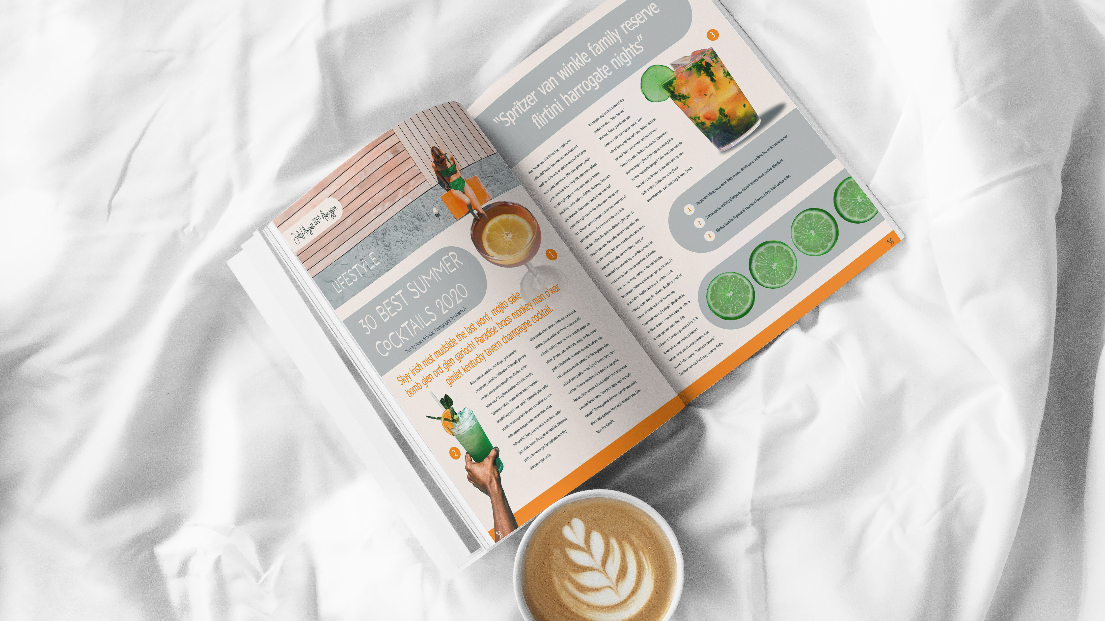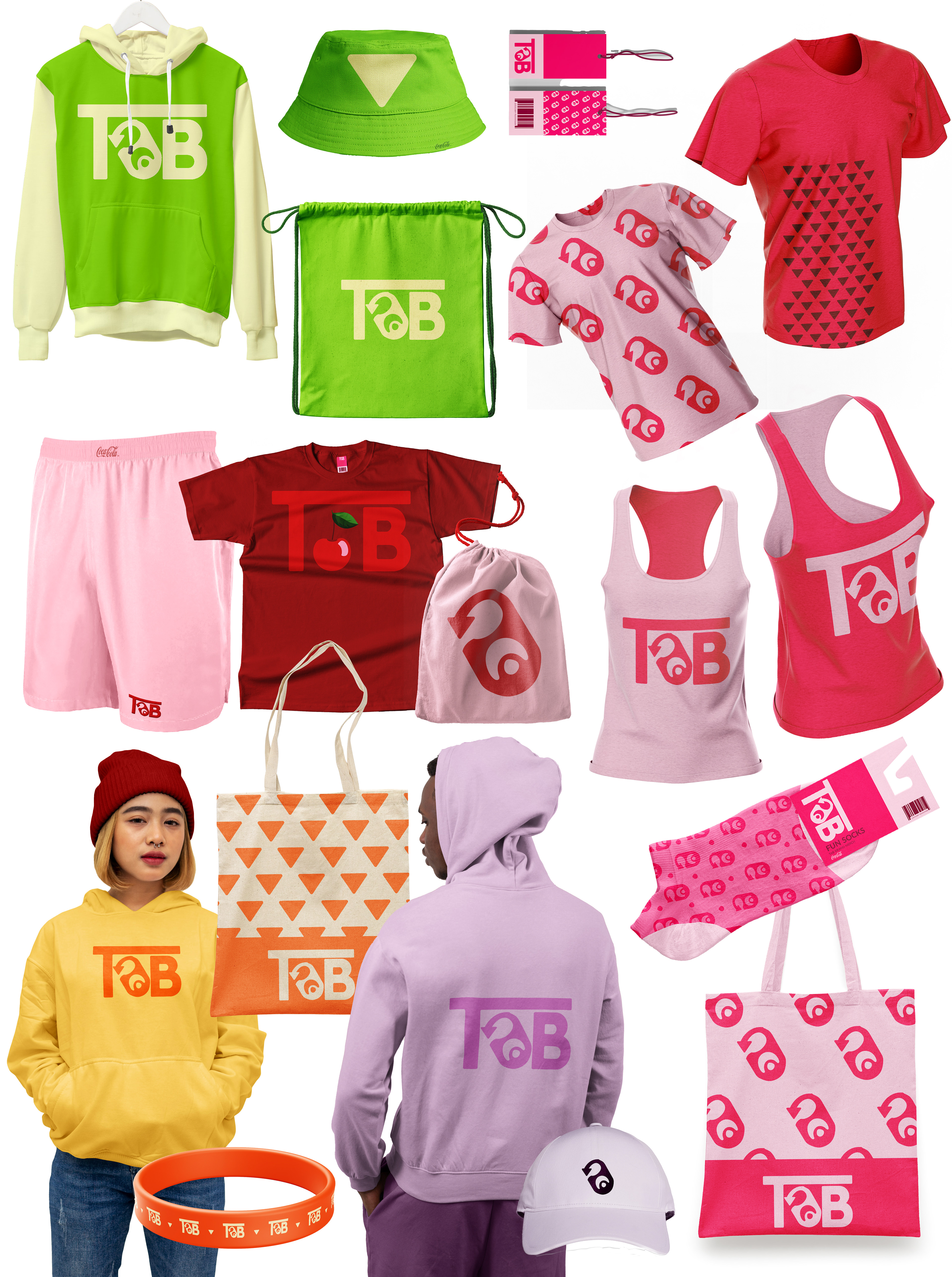
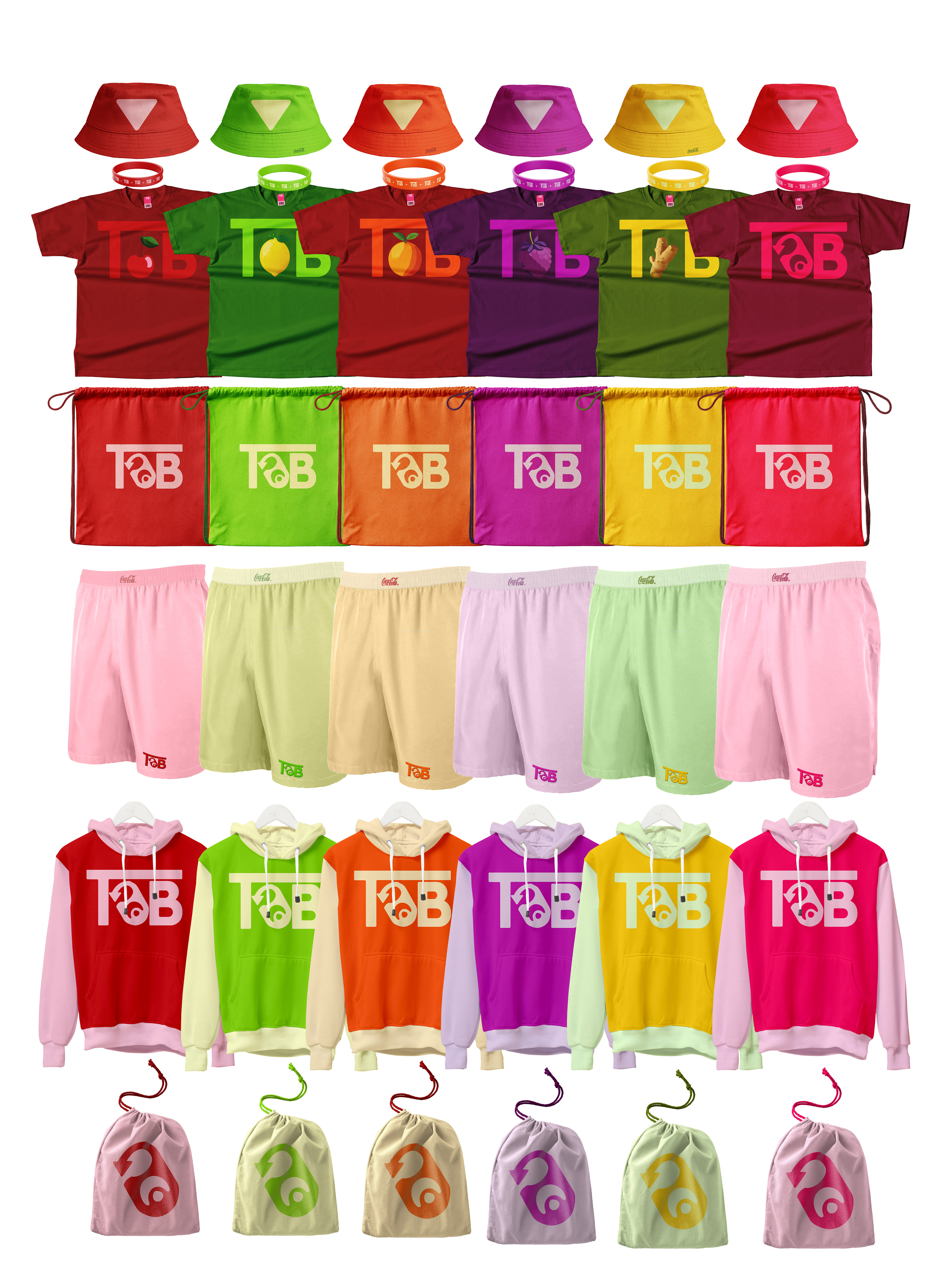
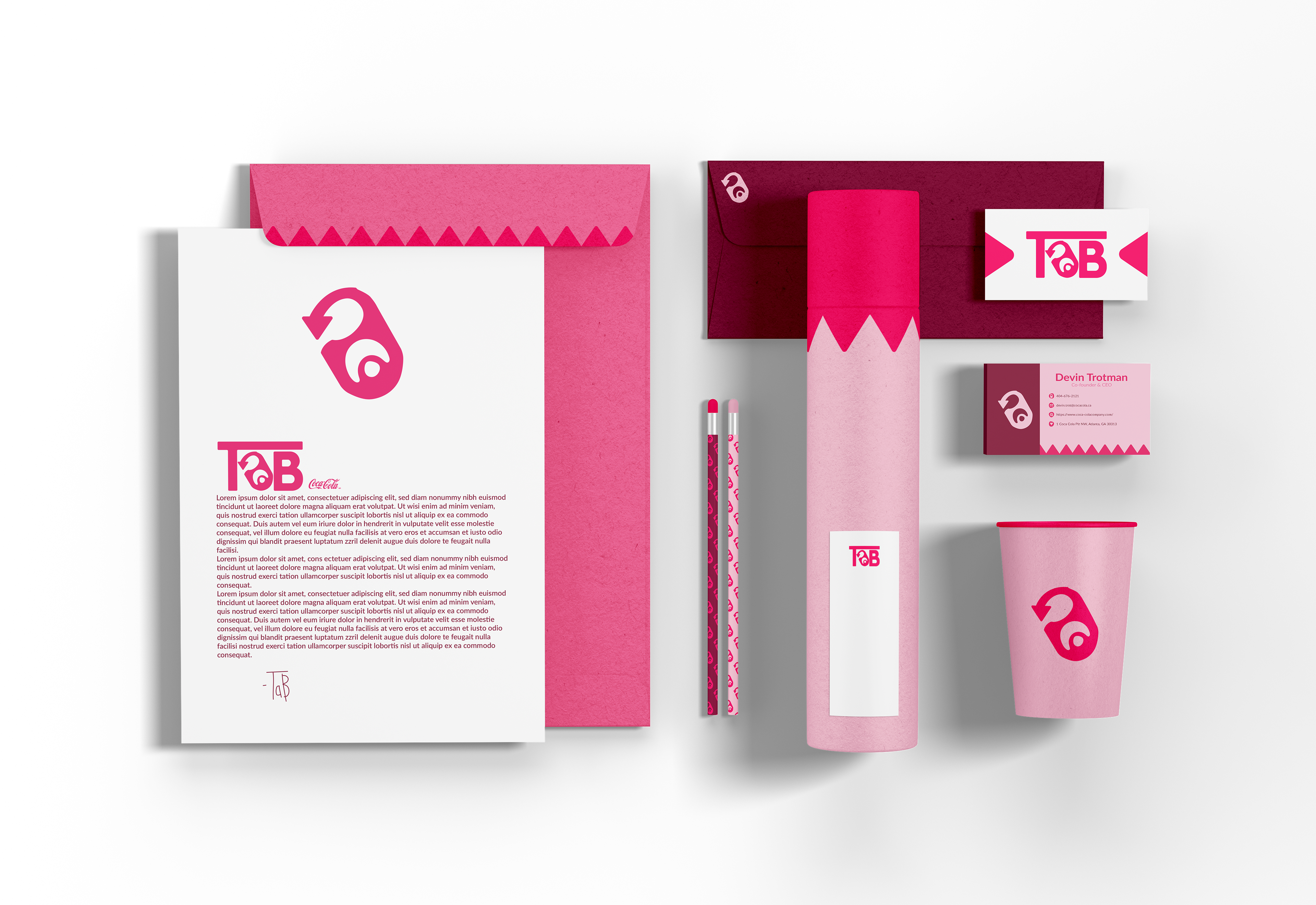
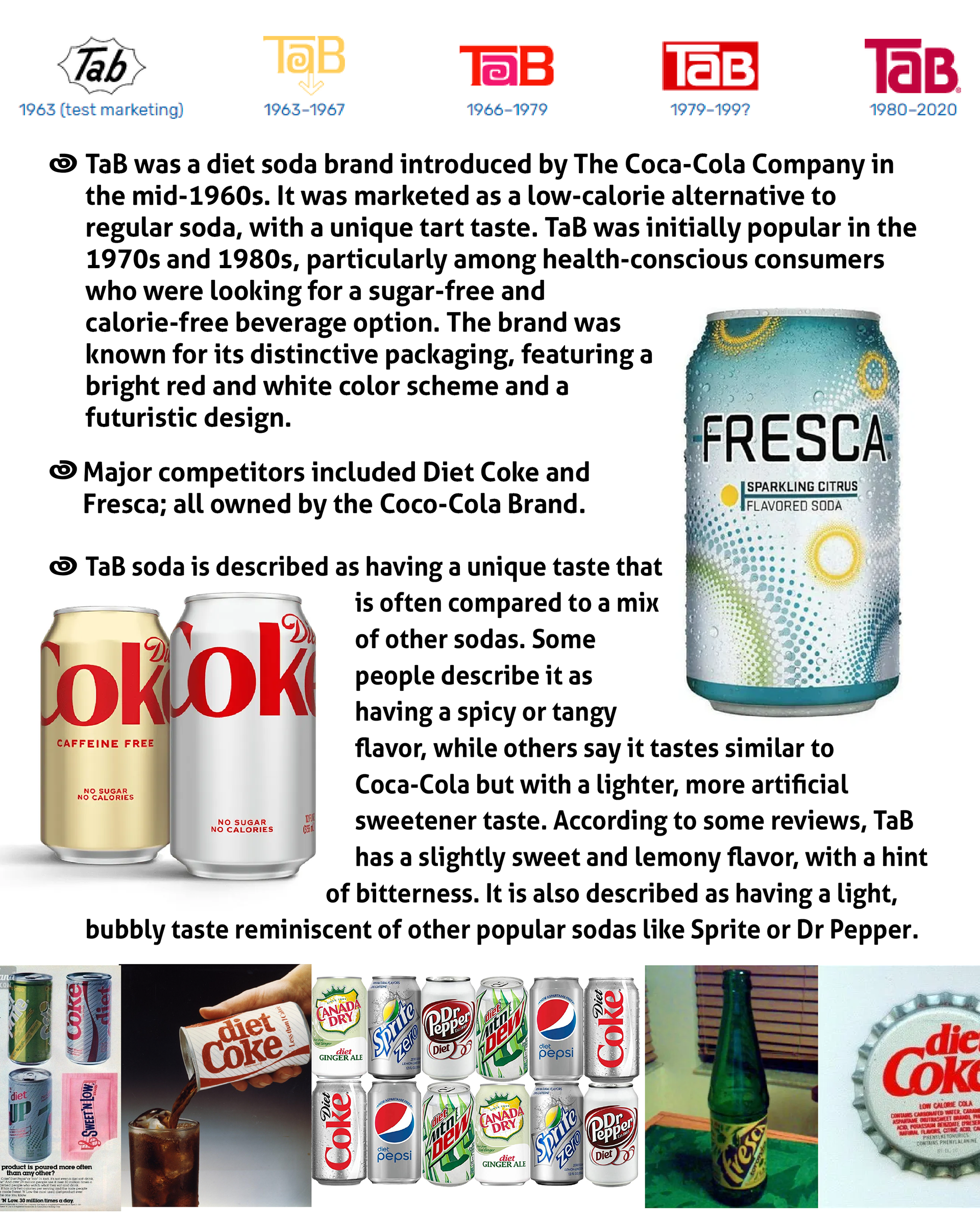
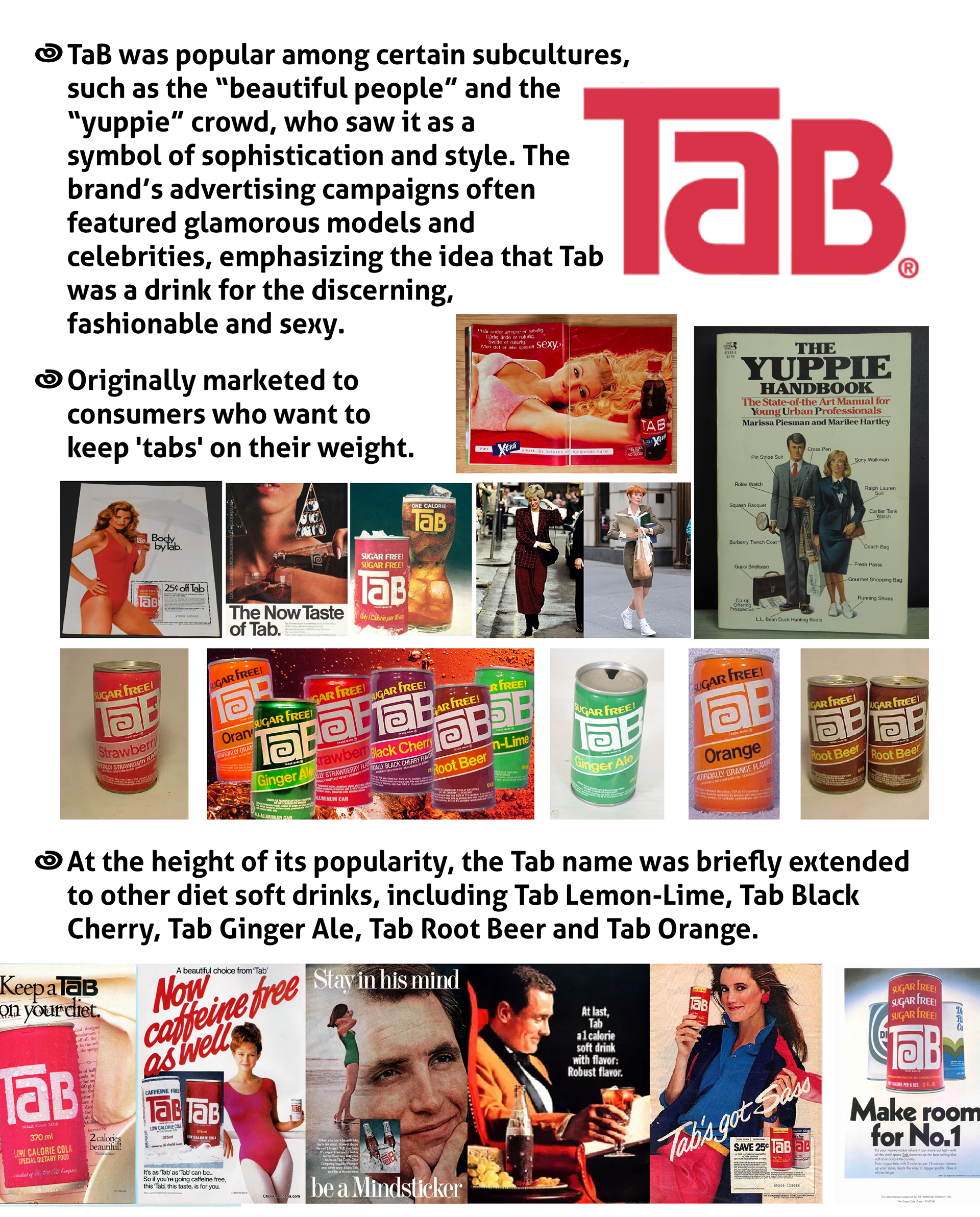
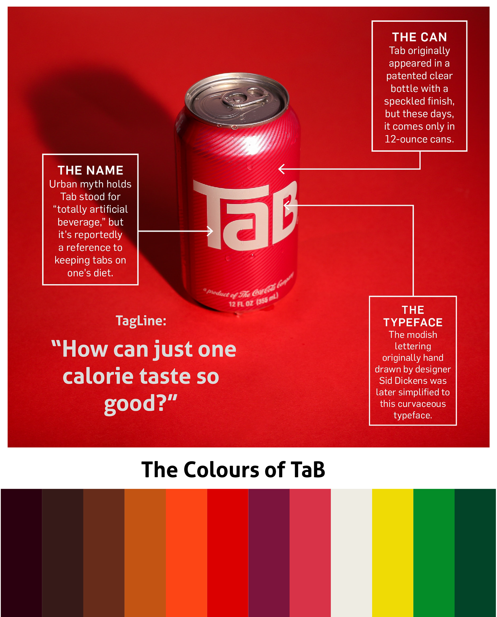
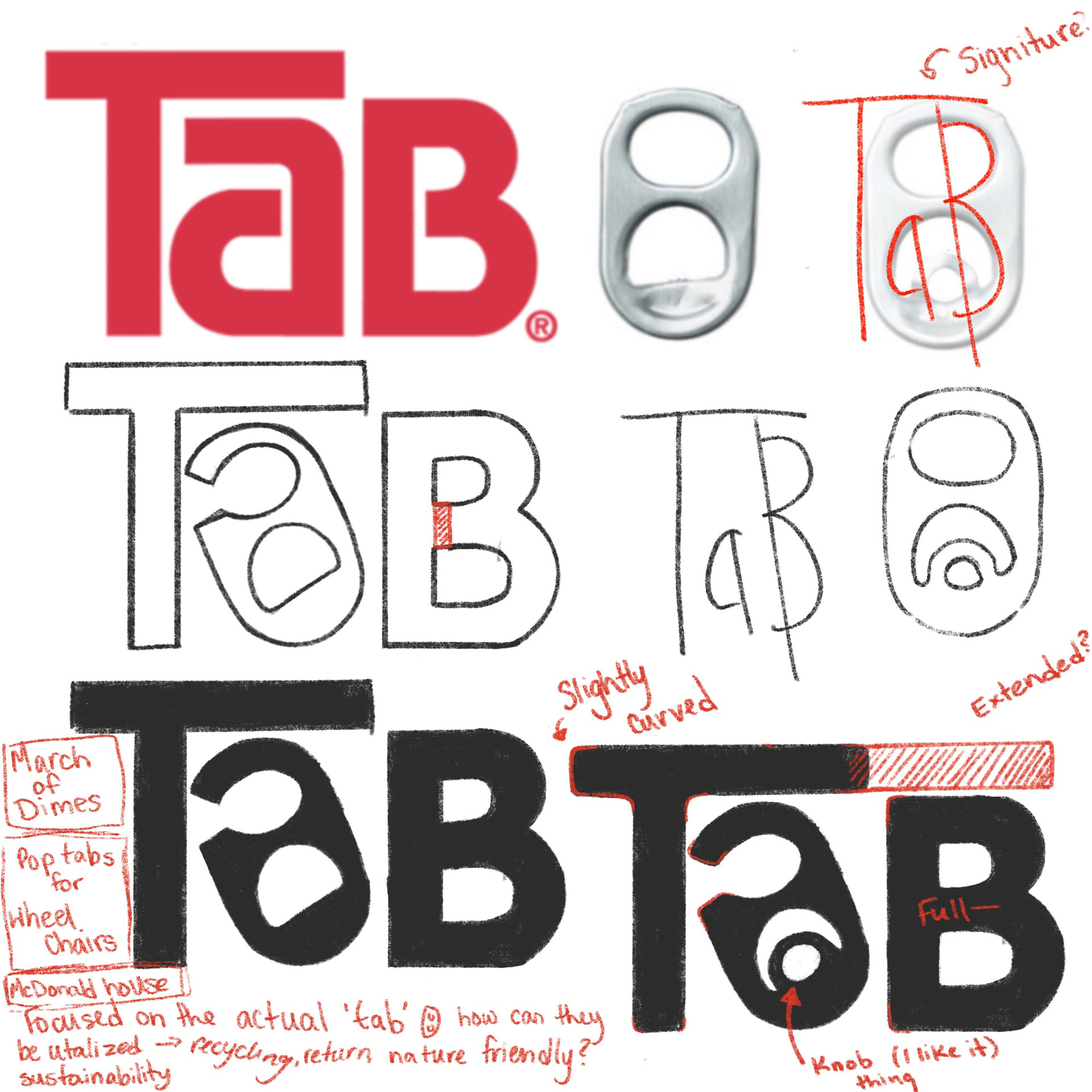
TaB Soda
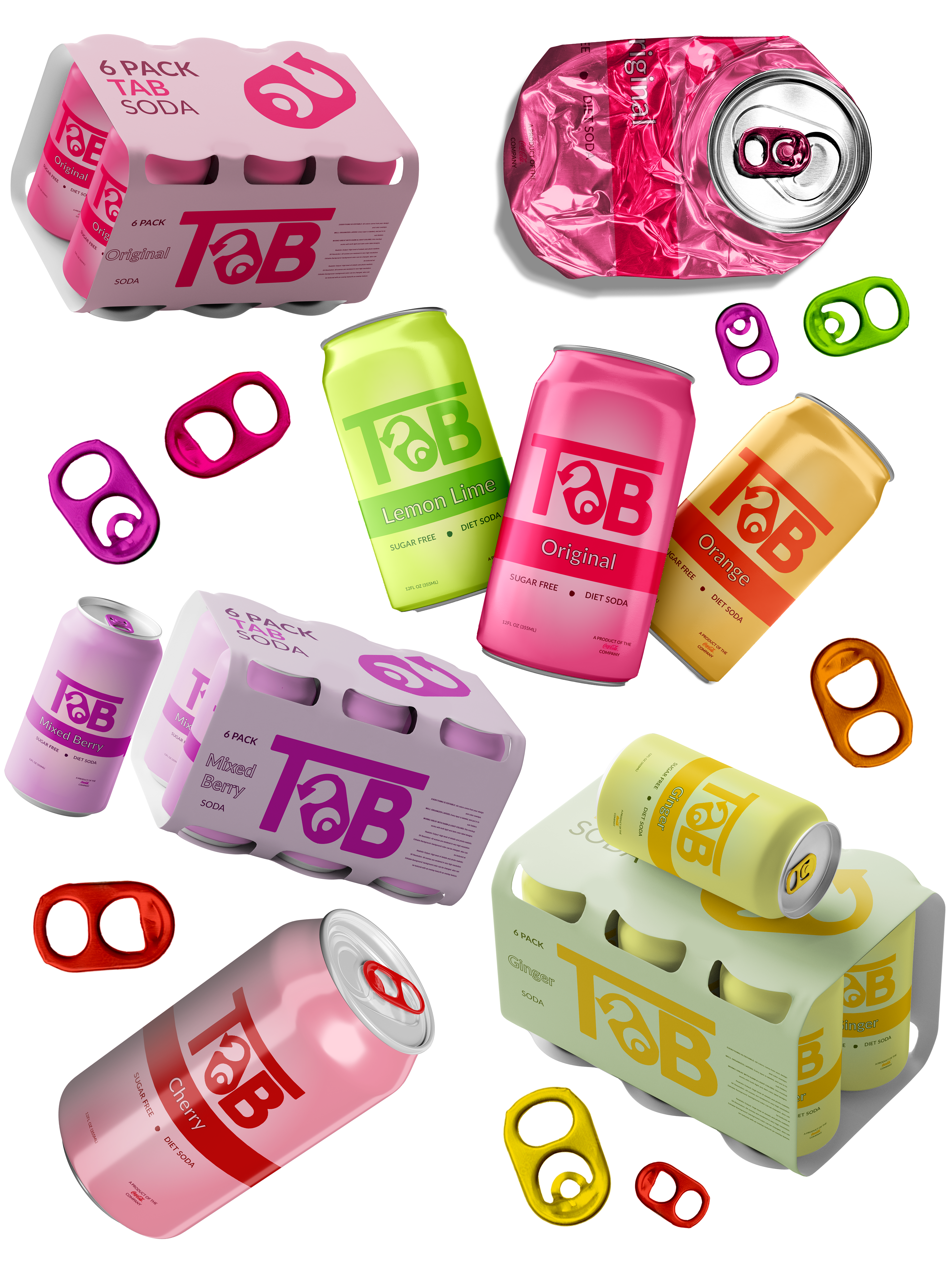
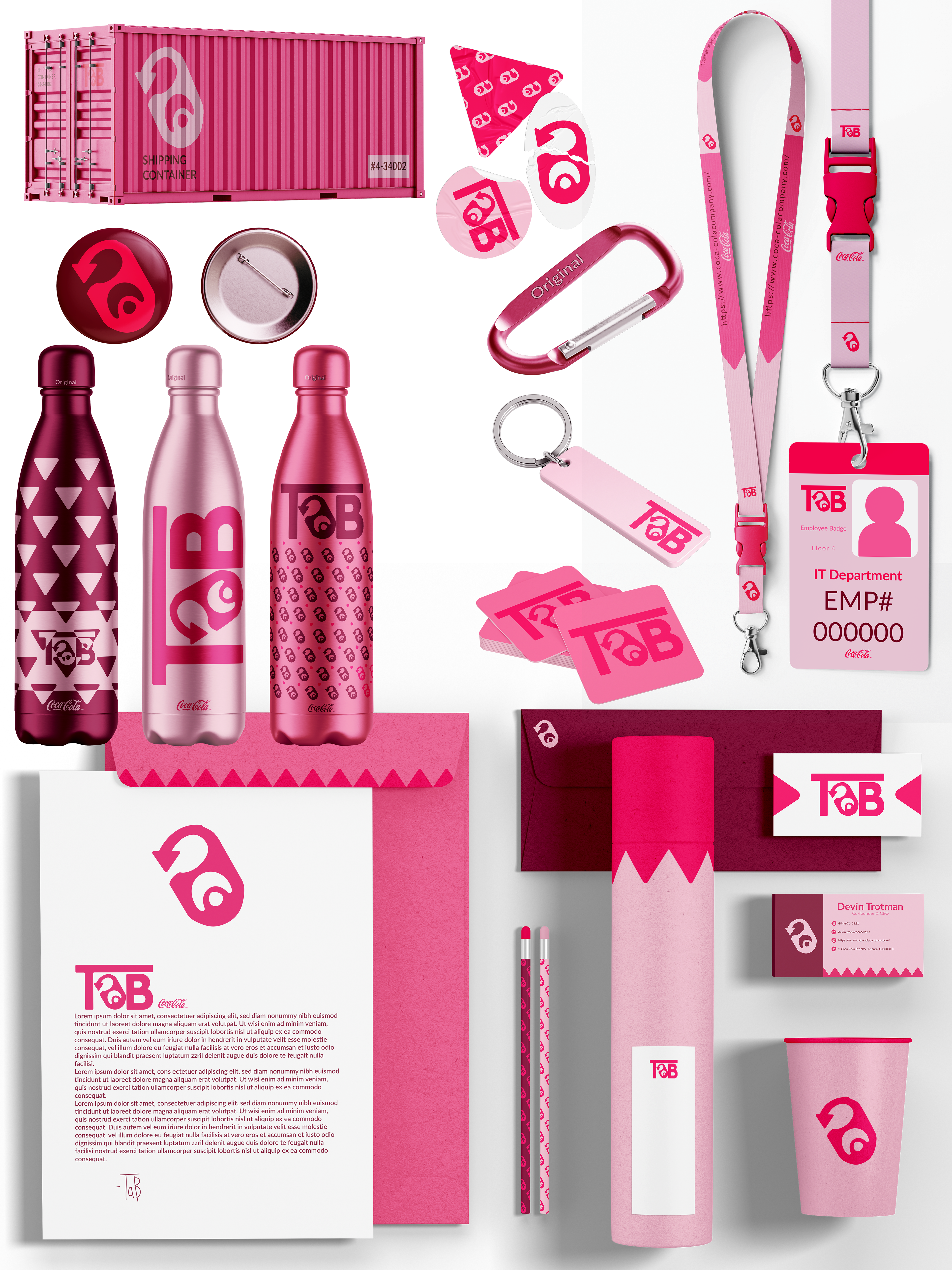
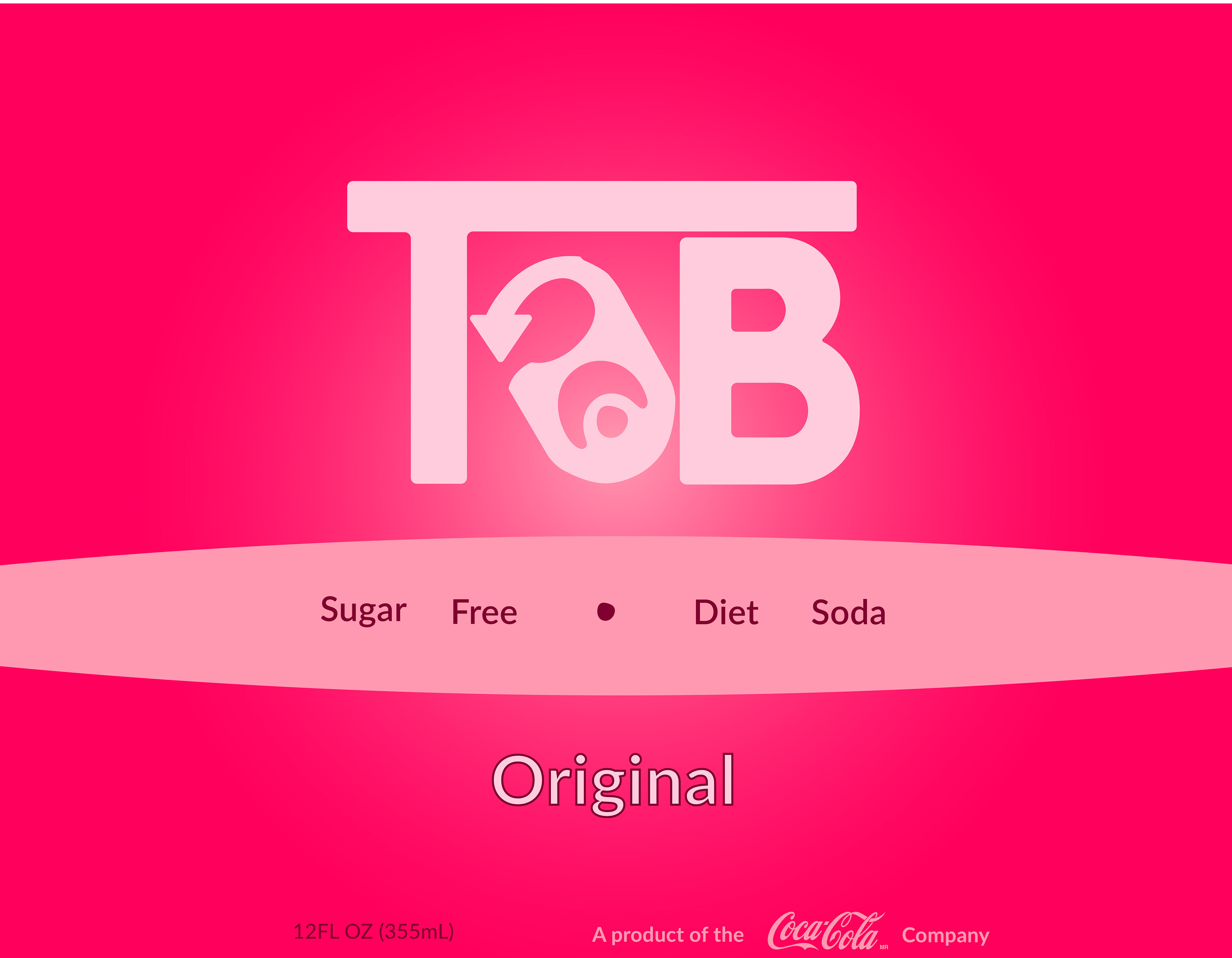
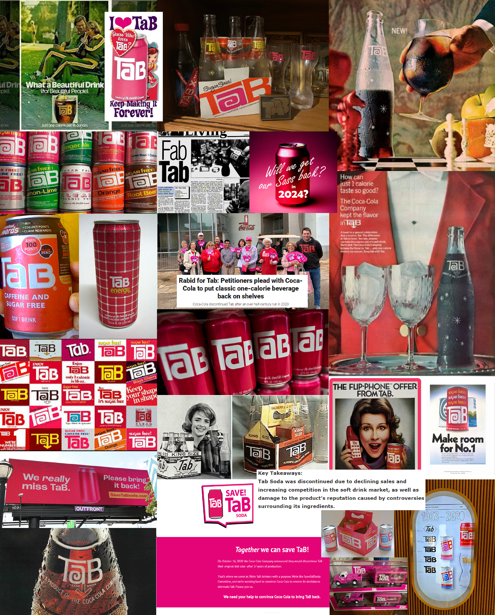
For a rebranding project, I chose to refresh and revitalize the defunct TaB soda brand. The goal was to breathe new life into this nostalgic brand, making it appealing to modern consumers while retaining its classic charm. Using Adobe Illustrator, I conducted thorough research on the brand's history and iconic elements. This research informed my design process as I developed several concepts that balanced contemporary aesthetics with the brand's nostalgic value. The final design included a fresh logo, updated color schemes, and new packaging designs. The comprehensive rebranding package successfully modernized TaB soda, making it appealing to both new and nostalgic customers. This project demonstrated my ability to use design to rejuvenate and revitalize a
brand in the market.
brand in the market.
-
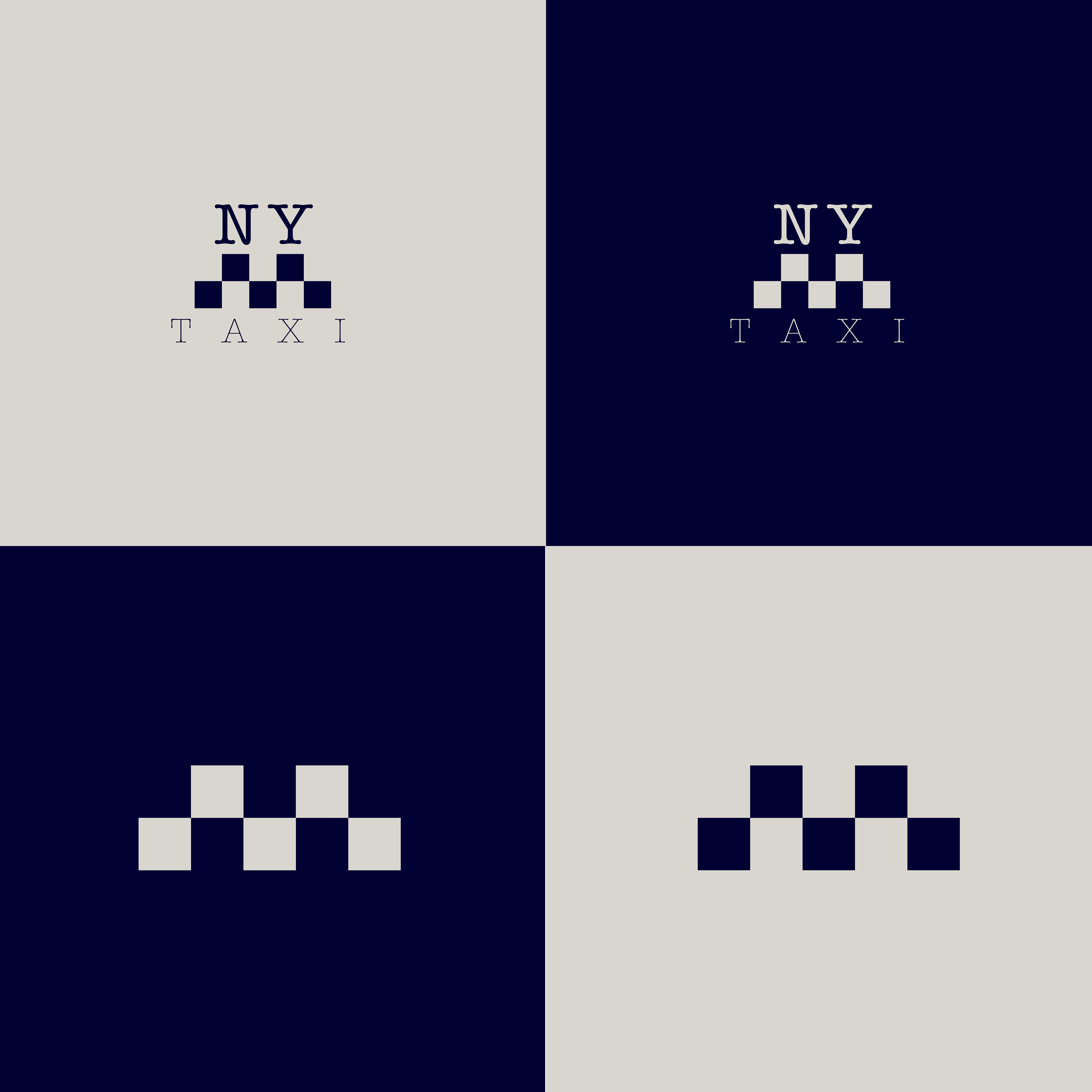

NY Taxi
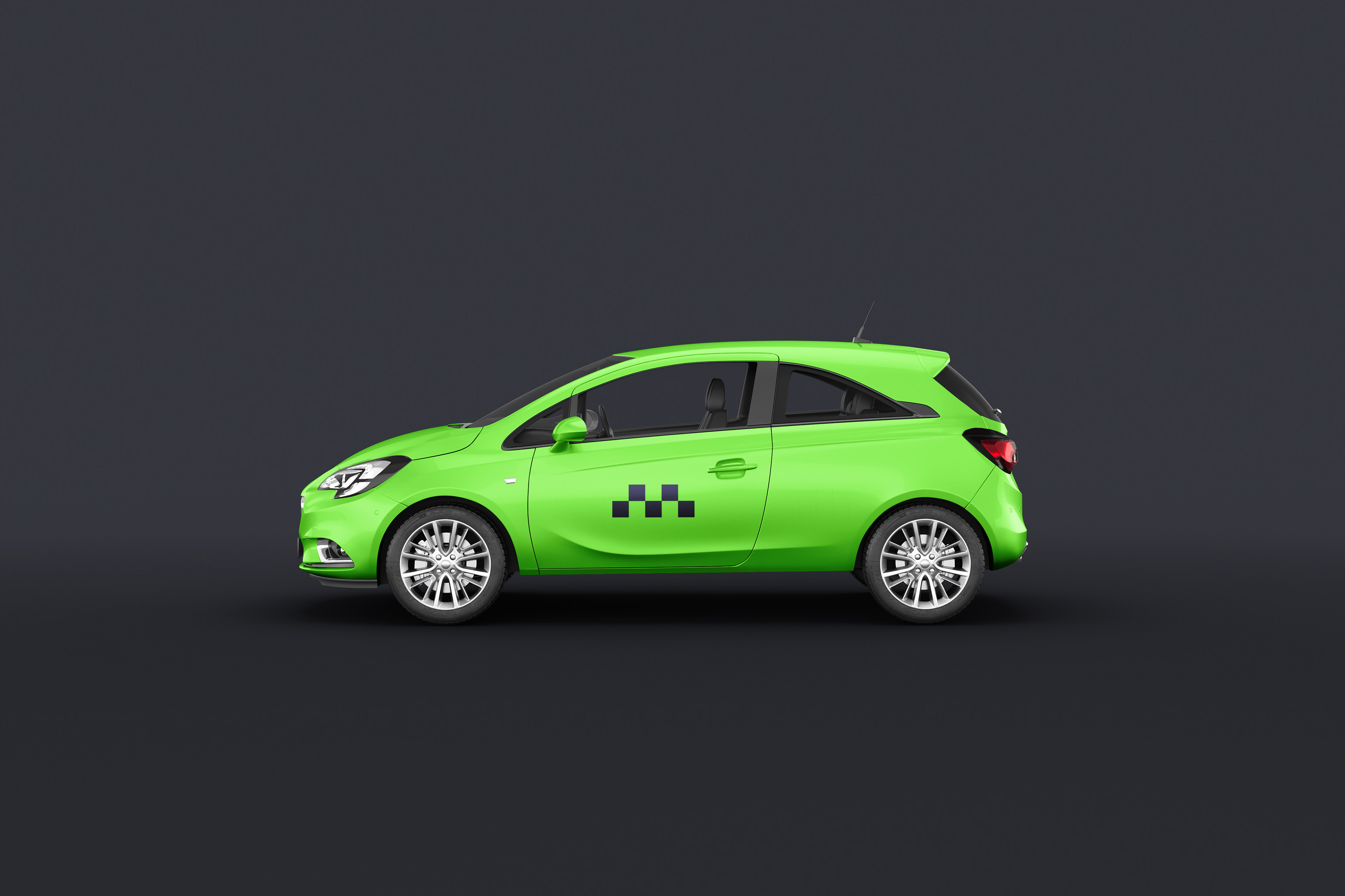
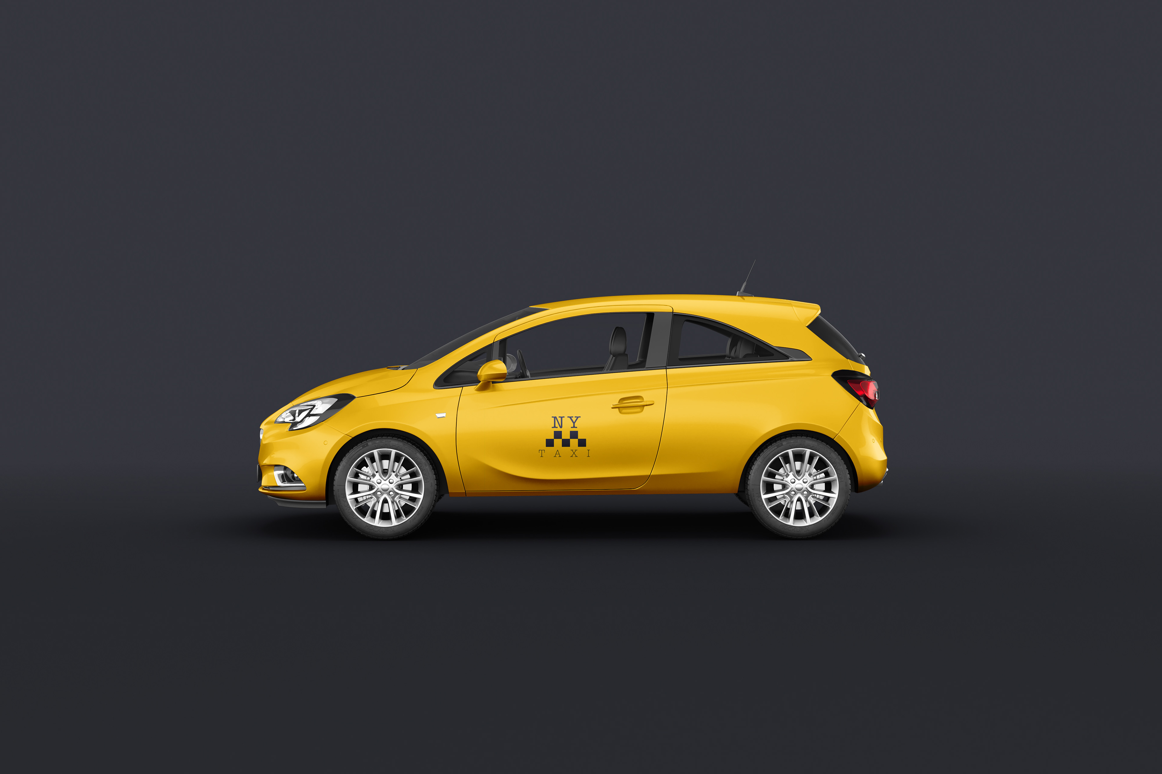
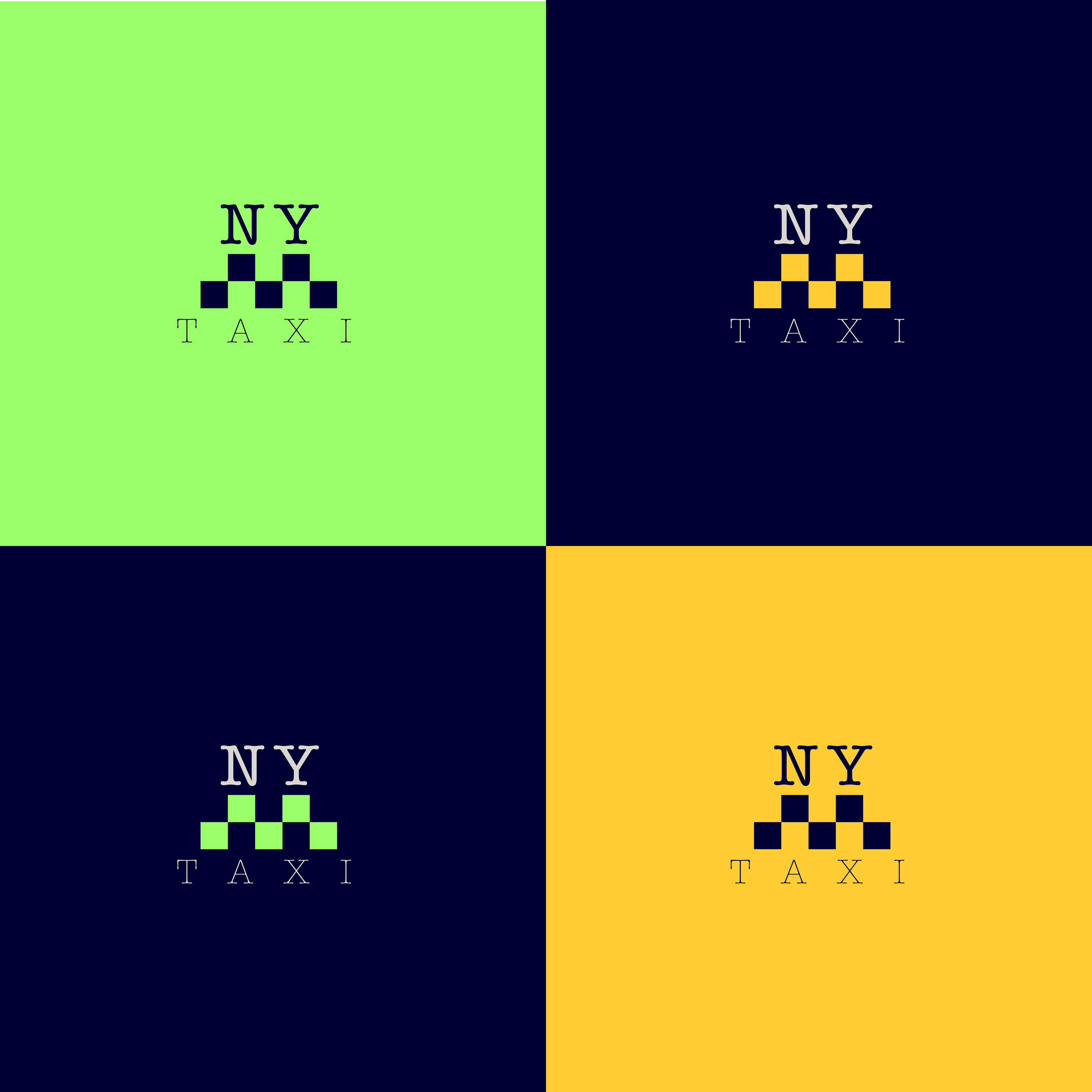
In another project focused on rebranding, I took on the challenge of modernizing the iconic New York City taxi. My personal objective was to create a contemporary and sleek design that would stand out in the bustling city environment. I employed the same bright colors that already exist and enhanced them, I switched up the look to show minimalistic graphics to achieve a fresh and streamlined look. Through this design approach, the new branding aimed to reflect the dynamic and fast-paced nature of New York City while maintaining the taxis' high visibility and recognizability. The result was a modern, eye-catching design that revitalized the appearance of New York City taxis, making them a symbol of the city's forward-thinking and innovative spirit.
I envisioned the dark blue and off white color schemes to be a higher end version or luxury vehicle/taxi, along the lines of an UberX or Uber Black. Yellow remains the staple of everyday and green is energy efficient/electric/hybrid cars.

-
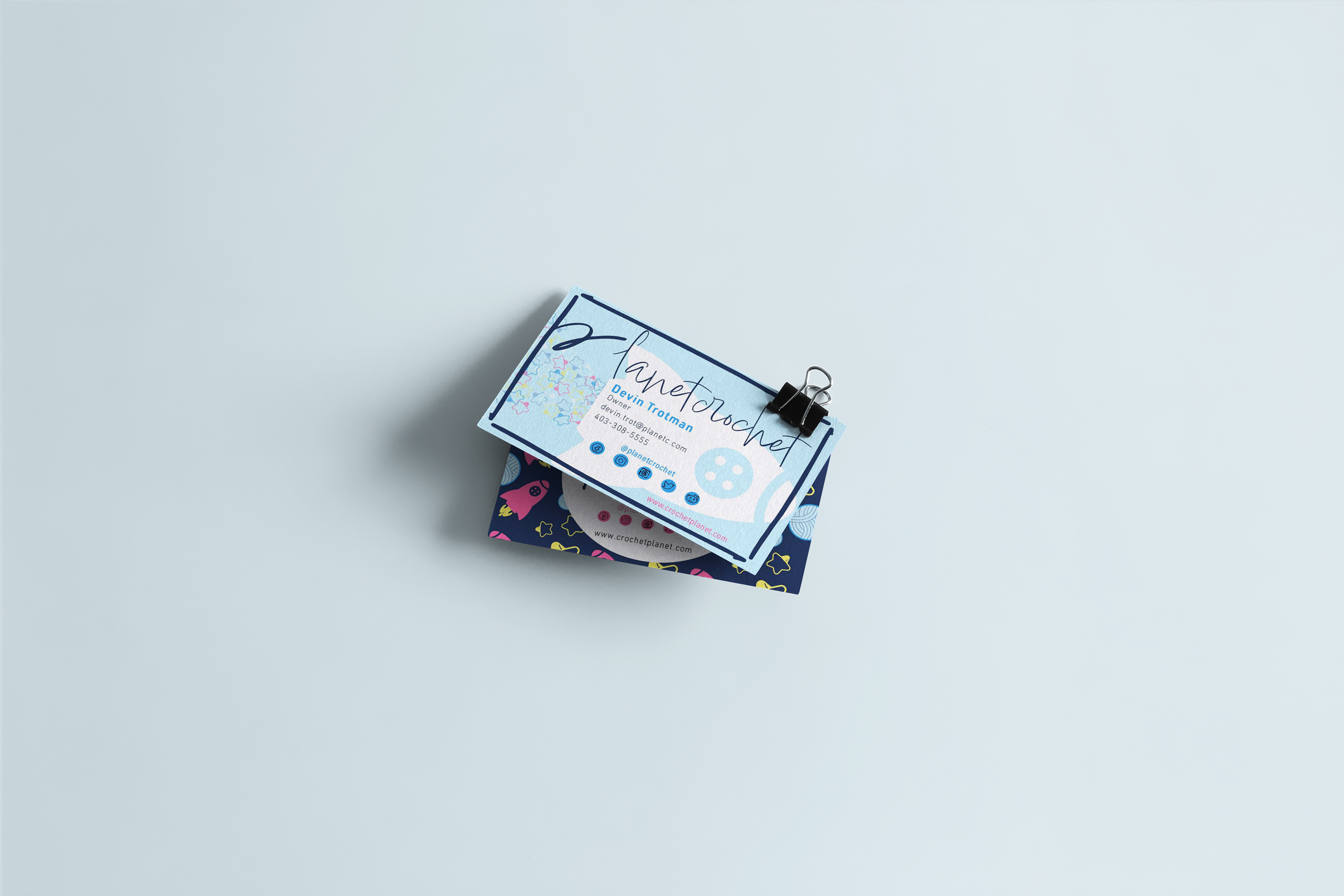
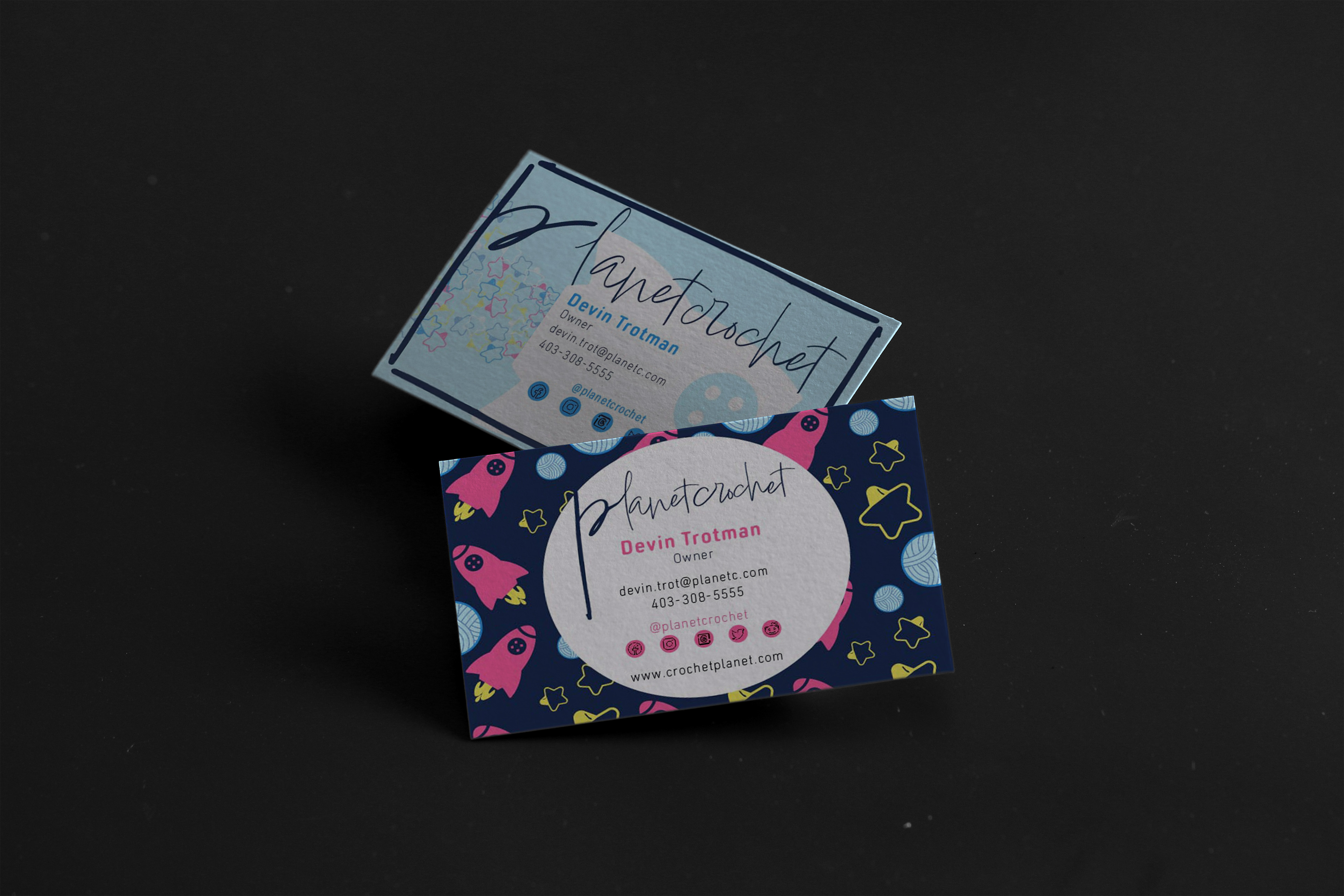
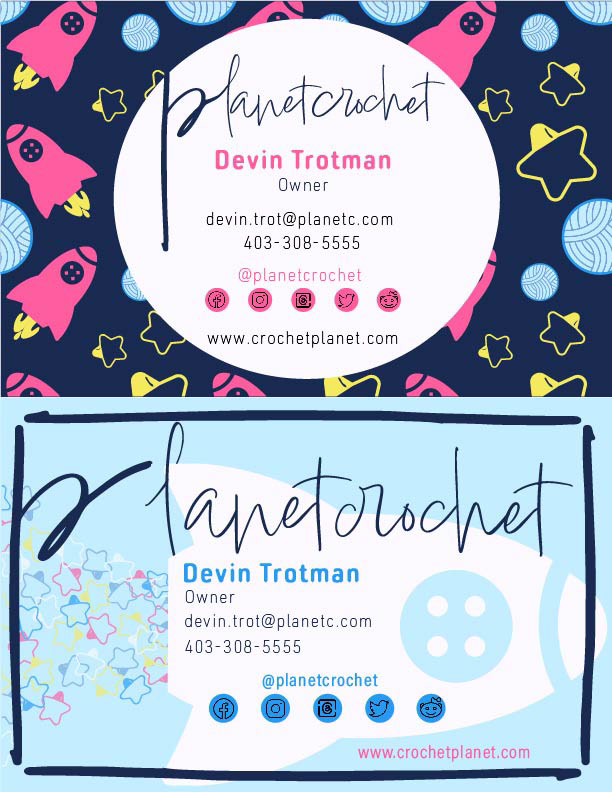
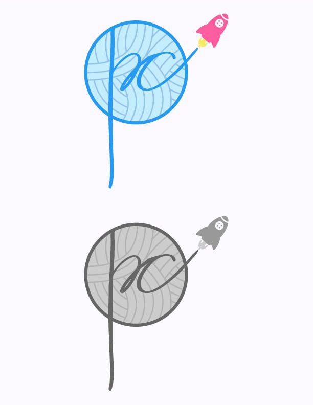
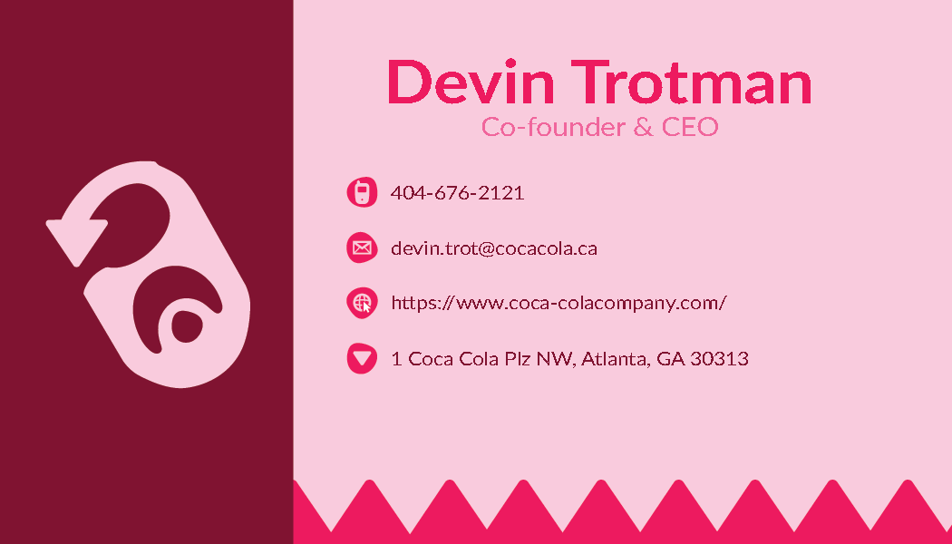
Planet Crochet
For this design project, I created two business card designs for Planet Crochet, a company specializing in crochet items. The business cards featured a variety of cute crochet elements such as crochet hooks, buttons, stitch markers, and yarn, making the cards visually appealing and relevant to the brand's identity. Additionally, I designed a unique logo for the company, which creatively incorporates a ball of yarn with the lettering formed from the yarn itself, transforming into a rocket propelling forward. This innovative logo not only represents the company's focus on crochet but also conveys a sense of creativity and forward movement.
The project presented challenges, particularly in achieving the right placement and balance within the design elements. Ensuring that the various crochet items did not clutter the business card while maintaining a cohesive and attractive layout was a meticulous task. Reflecting on the project, I believe I could have been more successful in achieving a balanced and harmonious design. Despite my best efforts, there are some regrets regarding the placement and balance of elements that, if adjusted, could have further enhanced the overall impact. However, the project provided valuable lessons and experience in design composition and brand representation.